

Creating a fundraising appeal is tough—don’t let anyone tell you differently. While annual fund “best practice” and “how-to” articles can be helpful, sometimes the best way to learn is to study real emails crafted by annual fund appeal teams.
In this post, we’ll analyze three top-notch email appeals. Although the emails vary in style and structure, they have a few important characteristics in common. Here’s what makes these creative annual fund appeals great:
- Eye-catching photos or other multimedia
- Copy that is brief, personable, and catered to a segmented audience
- Multiple links to the giving page within the email
- A clear call-to-action
Let’s take a look at these annual fundraising appeal examples in action.
Example 1: Cornell University’s End-of-Year Fundraising Appeal
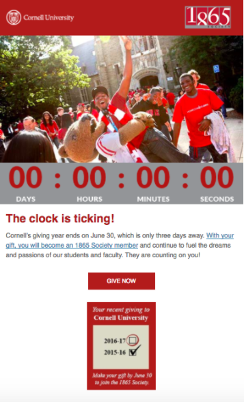
Cornell’s recent end-of-year campaign is one of the coolest we’ve seen. Leading up to a June 30 deadline, the team sent a series of emails encouraging LYBUNTs to make a gift so they could join the 1865 Society. As part of the header, the email featured a live, second-by-second countdown to the end of the fiscal year.
Not only was there a striking headline (“The clock is ticking!”), but the countdown was a creative way of urging donors to act quickly. If you want to try adding a timer to one of your solicitations, check out this site.
Example 2: Boston University’s Giving Day Solicitation
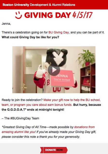
During Boston University’s 24-hour annual Giving Day 2017, they raised more than $2.3 million from over 11,500 gifts—an increase of $800,000 from the previous year. BU’s success was due in part to a stellar marketing campaign.
The sample above is a prime example of a well-crafted fundraising email. It’s easy to follow, succinct and possesses a clear call-to-action—the features of any successful appeal.
But BU took things a step further to make this email special: they embedded a personalized promotional video. The contact’s name appears directly in the video (on signs, cakes… you name it), demonstrating the power of customized multimedia in sparking a response from donors.
Click here to learn more about BU’s targeted Giving Day appeal strategy.
Example 3: Cheshire Academy’s Katz vs. Cats Challenge Email
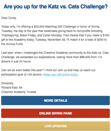
Cheshire Academy (CA) is a private preparatory school in Connecticut. On their #GivingTuesday last year, Trustee Richard Katz offered to match up to $25,000 in gifts for the Katz vs. Cats Challenge.
To promote the challenge, CA sent emails like the one above linking to a custom Kats vs. Cats giving page. In just 24 hours, the school raised $115,644 from 130 donors—a 30 percent increase in dollars and 14 percent increase in donors from the previous year.
Here’s why CA’s email appeal was compelling to donors:
- The message was brief and personal. CA’s email read like a personal message from Richard Katz. This resonated far more with readers than a generic, templated message.
- It outlined a clear goal and call-to-action. The campaign is easy to understand and right to the point—pure fundraising email gold!
- The email’s design was eye catching. CA’s dynamic header image helped grab viewers’ attention.
- It demonstrated impact. The ‘Live Updates’ link at the bottom of the email sent readers to a page that tracked donations in real-time so that everyone could see progress.
Fundraising emails come in all shapes and sizes. Although there are annual fund best practices to follow, there’s no one recipe to create the perfect appeal. Test what works with your audience, measure your results, and tweak your strategy accordingly. We hope this gives you a few new ideas to try as you plan out your campaigns for the year.