Erin is the Director of Product Management at EverTrue. She is a seasoned leader of higher education advancement programs with extensive background in campaign planning, advancement services, alumni engagement, and operations.
Earlier this year, The Solas Group joined the EverTrue family. By combining the leader in data engineering, predictive modeling, and analytics with EverTrue’s user-friendly platform, we are one step closer to building the advancement sector’s most holistic technology solution.
Every organization in the world has data, and their data is growing each day. We’re not going to walk it back and suddenly find ourselves having less data. Data is in a continual state of exponential growth.
Given that, we can no longer fully understand our data if we don’t visualize it. It’s incomprehensibly massive. So, let’s talk a bit about why visualizing data matters. Why it’s a necessity disguised as a luxury. And why the need for visual data that drives fundraising is only going to increase over the next decade and beyond.
First things, first. What is it about visualizing data that makes it not only more interesting, but more actionable?
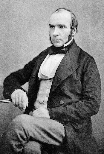
Let’s start with this guy. His name is John Snow. Not to be confused with “The King of the North,” this John Snow had a theory he was racing to prove.
The original John Snow
The year was 1854, and London was overrun with a devastating cholera epidemic. You have to remember that, in Victorian times, germ theory wasn’t widely accepted. So, many people thought the cholera was caused by “miasma,” or contaminated air.
But Snow hypothesized that cholera was being spread through germs infecting the water system. (Spoiler alert: he was right.) Of course, back then he didn’t have the technology to show people that the water was contaminated. So instead of showing them germs, he decided to show them data.
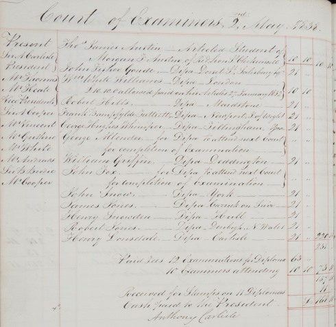
Old school data
Like most databases, his data didn’t start out in a useful format. This is a page taken from the book Snow was working with. The book contained pages and pages of handwritten notes listing every Londoner known to have cholera along with their home address.
Imagine trying to draw a conclusion from an entire book filled with pages like this. It’s absurd. But it’s no different than looking at a massive spreadsheet with hundreds of columns and thousands of rows of donor information. (That’s basically your alumni database.) Before data visualization tools became accessible, there weren’t many ways to present data that were more intelligible than this.
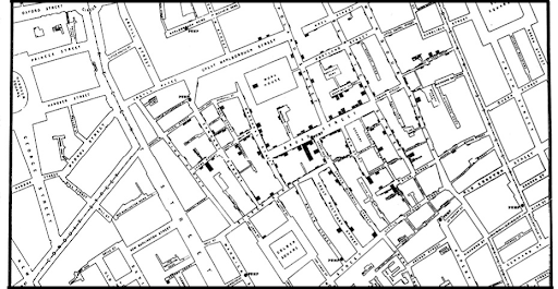
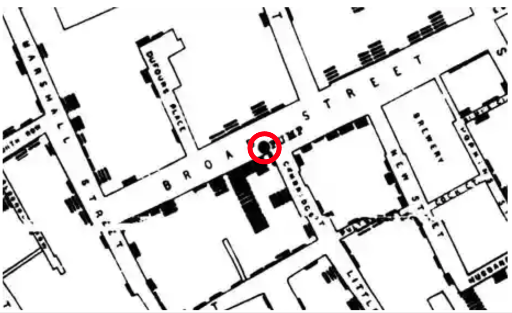
John Snow's map of Soho
This image shows a zoomed-in view of the visualization Snow created. He started with a map of the Soho district of London, the epicenter of the outbreak, and he drew little boxes above the addresses of each infected resident. Where there were multiple cases at one location, he would stack the boxes on top of each other so it showed what basically became a bar chart. See those black lines along the street?
The section of Soho shown right here was where the cases were coming from. It didn’t take long before this map made his next step clear.
The most problematic water pump in Soho
The map showed that the closer people lived to a specific water pump on Broad Street, the more likely they were to become infected. You can even see the water pump on the map (circled in red).
So what was Snow’s great idea for ending the outbreak? Breaking the handle off of that one water pump. This is a true story. Snow showed his map to City officials and convinced them to try breaking that water pump handle to see if it would end the cholera outbreak. It worked, and the rest was history. This is the story of how epidemiology started.
Data visualization for the win!
We all know that Snow’s map was easier to understand than his handwritten case book. But, why? What makes visuals so much easier to comprehend?
It’s all about the human brain.
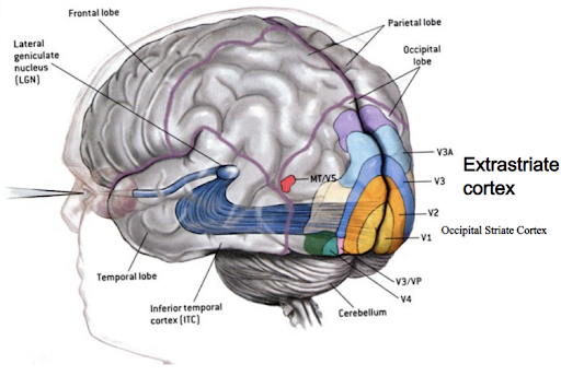
The extrastriate cortex: superhighway for visual data
Your brain is designed to process information visually. It processes images faster and with far less effort than text or numbers.
Our brains evolved in stages, and one of the first parts to develop was the area near the back and bottom of your brain (the extrastriate cortex). That’s where your brain processes visual information. Notice how the optic nerve at the back of the eye runs all the way back there. It’s a superhighway for visual data.
As we evolved, we developed the upper levels of the brain where most of our cognitive functions reside. So when we see numbers or text, it takes time to travel up to the frontal lobe where your brain must then interpret the data to make sense of it.
This type of data puts a much greater burden on our brains. It makes our brains do “work,” because everything we read must first be interpreted. We weren’t born knowing how to read or do math. But we were born with the ability to see a lion running towards us and to react in an instant. That is the kind of information our brains were designed to understand. That’s why data visualization is so much more effective than other means of communication.
Fun facts:
Your brain processes visual information 60,000 times faster than numbers or text.
You remember 30% of what you read but 80% of what you see or do.
Facebook posts with images get 87% more engagement than those with text alone, and adding images to tweets makes them 150% more likely to be retweeted.
BUT! You have to know how to do it.
All of the facts I just cited are only relevant to our work if we understand how the brain processes things like colors, lines, sizes, and shapes. Knowing how visual elements are consumed by the brain is vitally important. Simply putting numbers into a visual format alone isn’t sufficient.
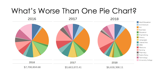
An example of data visualization gone all wrong
Here’s an example of a visualization that is as challenging to understand as a massive spreadsheet. There are two reasons why this image is so remarkably bad:
The use of pie charts. As we all know, pie charts represent the relative proportion of components of a thing that collectively add up to 100% of that thing. They show pieces of a whole. But this visual was made to show giving over three different years. The designer’s solution for distinguishing between those three years was to use three different pies. So, although every year yielded different fundraising results, these pies are all the same size and aligned horizontally. Nothing here in this visual shows a three-year giving trend even though that seems to have been the designer’s goal.
The segments. Pie charts only work if they have a limited number of segments. These pie charts have sixteen! With so many segments, each pie has multiple segments that are roughly the same size, which makes it impossible to tell which ones are bigger or smaller. Showing the relative size of each segment is the whole purpose of using a pie chart.
Overall, as happens all too often with bad visualizations, when you look at this, you’re left asking yourself “what am I supposed to do with this information?”
If you’re asking this question, you’re looking at a bad data visualization. Images aren’t helpful unless they’re easy to understand and unless what they say actually matters. In other words, people should be able to glance at a visualization and know what their next steps should be.
Here's the power of visual analytics:
Find the outlier.
Tough to find the outlier.
Much easier to find the outlier. Right?
Done right, visualization highlights the data you need to act on.
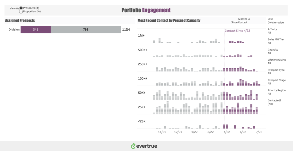
Sample EverTrue dashboard image
This dashboard, which will soon be available through the EverTrue platform, evidences how visuals can expedite understanding and obviate next steps.
It shows all assigned prospects who have, and who have not, been contacted within a user-defined number of months. There are two colors representing two things: contacted people and uncontacted people. The arrangement of prospects according to giving capacity helps prioritize the work to be done, and the timeline makes it obvious how recently they were contacted.
Looking at this, it’s evident why we should care. We need to contact the people who are uncontacted, starting with the highest-capacity prospects who have gone unattended the longest.
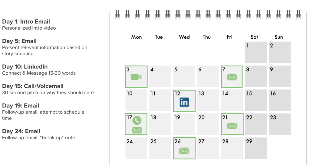
Same DXO cadence outreach calendar
We’re not talking about ad hoc outreach, but rather, guided, high-volumed outreach that we call cadences.
Here is an example of an EverTrue cadence in action: We train and coach hundreds of Donor Experience Officers around the country, and every one of them starts their day knowing exactly who they need to reach out to and what to tell them. Every message is personalized for that donor, but the technology makes it so easy to stay on top of consistent outreach.
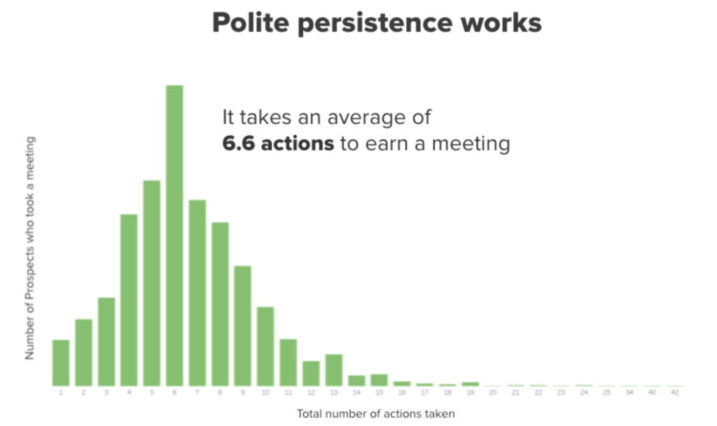
Hop tip from EverTrue Donor Experience programs: It takes an average of 6.6 touchpoints to earn a meeting with a donor. #PolitePersistence for the win, every time.
What's next?
As you may know, EverTrue acquired The Solas Group, the company I co-founded, back in March. Solas enjoyed a great reputation for fundraising analytics and data analysis inspired by years of higher education advancement experience. So you’re probably wondering now that we’re at EverTrue, what’s the plan? Right now we’re working to develop visually clear, action-oriented dashboards delivered within our platform. You’ll hear more about that soon.
But one thing I want you to know now is why we decided to join EverTrue. Like Solas, EverTrue is devoted to advancing the conversation around how data drives fundraising. Having grown our careers in advancement services, we cannot wait to work alongside our customers so we can continue to innovate. We will never replace our customers’ need to create their own internal dashboards. No product can do that entirely. But we’re confident that our industry knowledge and proprietary data will result in dashboards that address the most common advancement needs. Dashboards that are easy for everyone on the team to access on demand. This makes your entire office happier and more efficient. And it will give advancement technology professionals more time to innovate and deliver high-level analysis. It is truly a rising tide that lifts all boats.
This is just one of a few changes happening at EverTrue. We merged with ThankView last year, and recently we acquired both Pledgemine and Fundriver. Together with Solas, all of these companies have become part of EverTrue in order to deliver on the promise of strategic, fast, and personalized donor engagement at scale.
We’re so excited about what’s to come.
Want to learn more about EverTrue’s big plans for data-driven fundraising? Get in touch, I would love to chat.


")